

Vivaid
Each year, thousands of lives could be saved if more bystanders felt confident performing CPR. Yet many adults feel they lack consistent CPR training and struggle to recall the steps when it matters.
Challenge
to design a cross-platform mobile app that helps adults learn and retain CPR skills, with a focus on accessibility and real-world usability.
Parameters
Duration: 3 weeks, part-time
My Role: Lead UX designer
Tools: Figma, Miro, Google Slides, Google Sheets
Solution
A platform that is accessible, simple, and easy to revisit regularly, while providing informative and trustworthy CPR learning.
Research
Research goal
What is the user's need for quick and safe access to CPR knowledge and instructions?
How accessible is the information about CPR today, and how could it improve?
What frustrations do the users have when searching for information about CPR and lifesaving?
How do users want to refresh and retain this knowledge over time?
Interviews
To answer my research goals, I conducted targeted user interviews and synthesized findings into clear user needs and pain points:
“When finding information about CPR, I would search the internet and find many different websites. I don’t know if the information is updated or not, or if the source is reliable.”
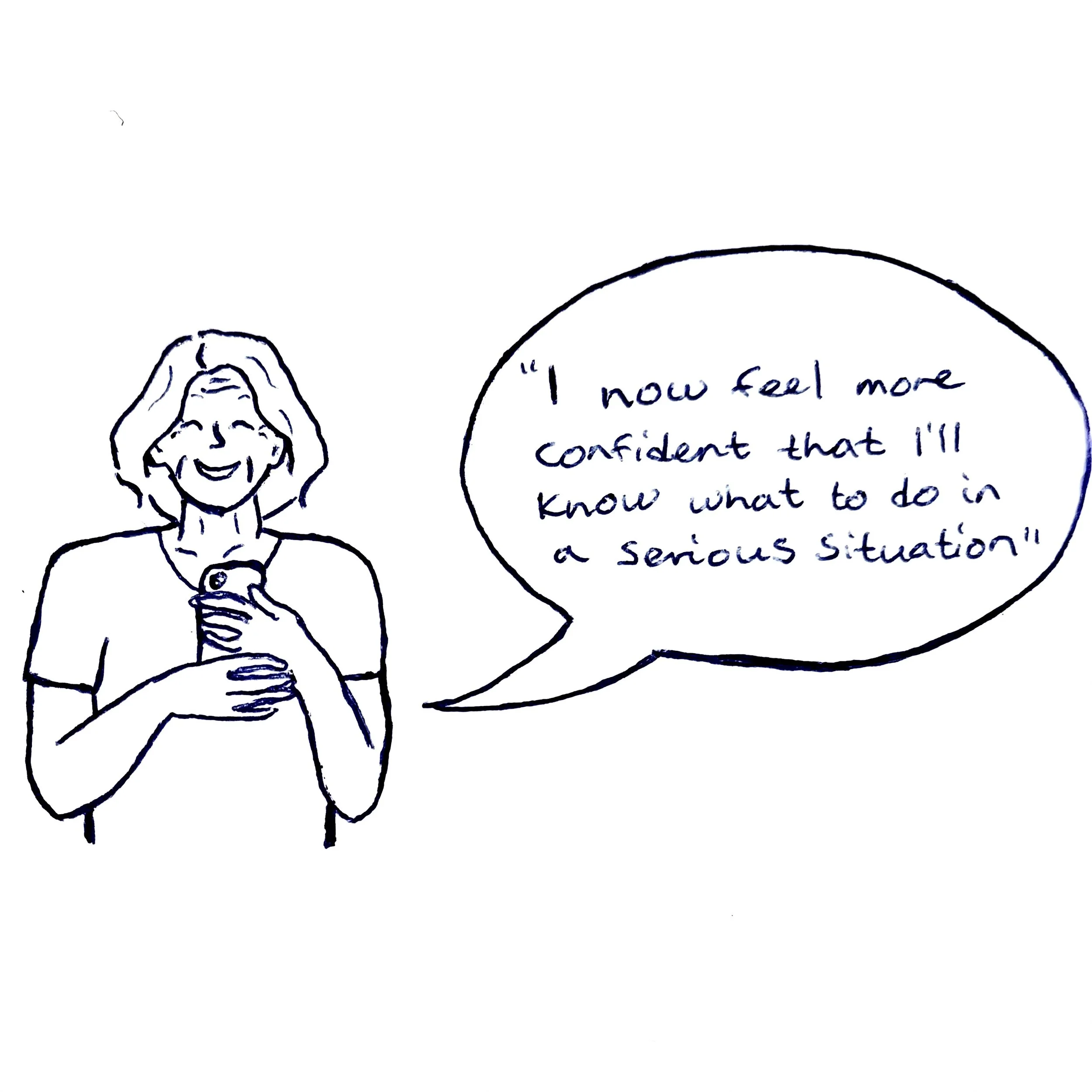
“I don’t feel confident in my knowledge of basic CPR and how to act or be of help if faced with a life-threatening situation.
“I have CPR training once a year, but I forget what I learned in between the training.”
Personas

Daija
“I want to help in an emergency, but I’m afraid I’ll mess something up or do more harm than good.”
Daija is a 61-year-old anthropologist who lives with her husband. She and her husband stay active by exercising and going on walks. Danija has mild arthritis, which affects her hand mobility and speed. She prefers apps with clear instructions and finds it difficult to read text with low contrast because of reduced vision.
Goals
Feel empowered and confident to help in a crisis.
Have one trusted, easy-to-use source for CPR knowledge.
Be able to refresh skills regularly without having to sign up for a full class every time.
Frustrations
Confused by inconsistent information from Google searches.
Has attended CPR training, but forgets techniques and ratios a few months later.
Worries that her arthritis and reduced vision might prevent her from being effective in an emergency.

Mateo
“I want to help—but most CPR training videos don’t include sign language or captions I can actually rely on.”
Mateo is a 34-year-old coordinator who lives with his wife and 1 child. Mateo has had hearing loss since the age of 12 and is fluent in ASL (American Sign Language) and lip-reading. Mateo uses an iPhone with accessibility features like haptic feedback and visual alerts, and prefers apps with full captioning, ASL support, or strong visual guides.
Goals
Be able to confidently perform CPR without relying on audio.
Learn at his own pace with visual cues, not just written instructions.
Find trusted CPR info in one place, rather than having to vet websites or decode unclear captions.
Frustrations
Wants to help in emergencies but lacks real-time guidance he can follow nonverbally.
Attended CPR training at work, but information wasn’t fully accessible—interpreters were rushed or absent.
Struggles to retain what he learned due to poor visual materials.
Learn more about my research process
Ideate
Storyboard
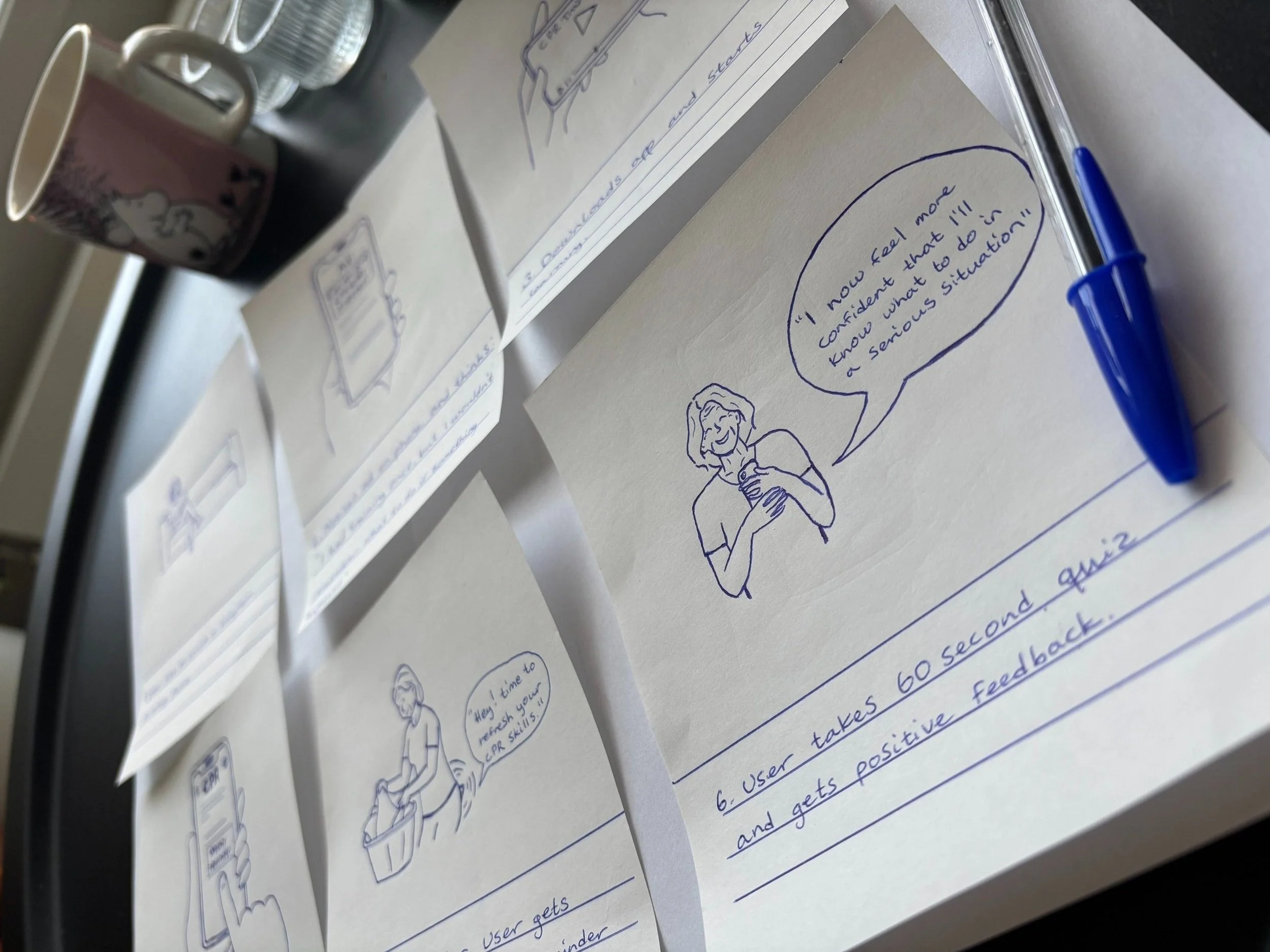
I created a storyboard to illustrate how users might interact with the CPR app in real life. Storyboarding helps me step into the user’s shoes and map out key moments, emotions, and decisions before jumping into wireframes or prototypes.
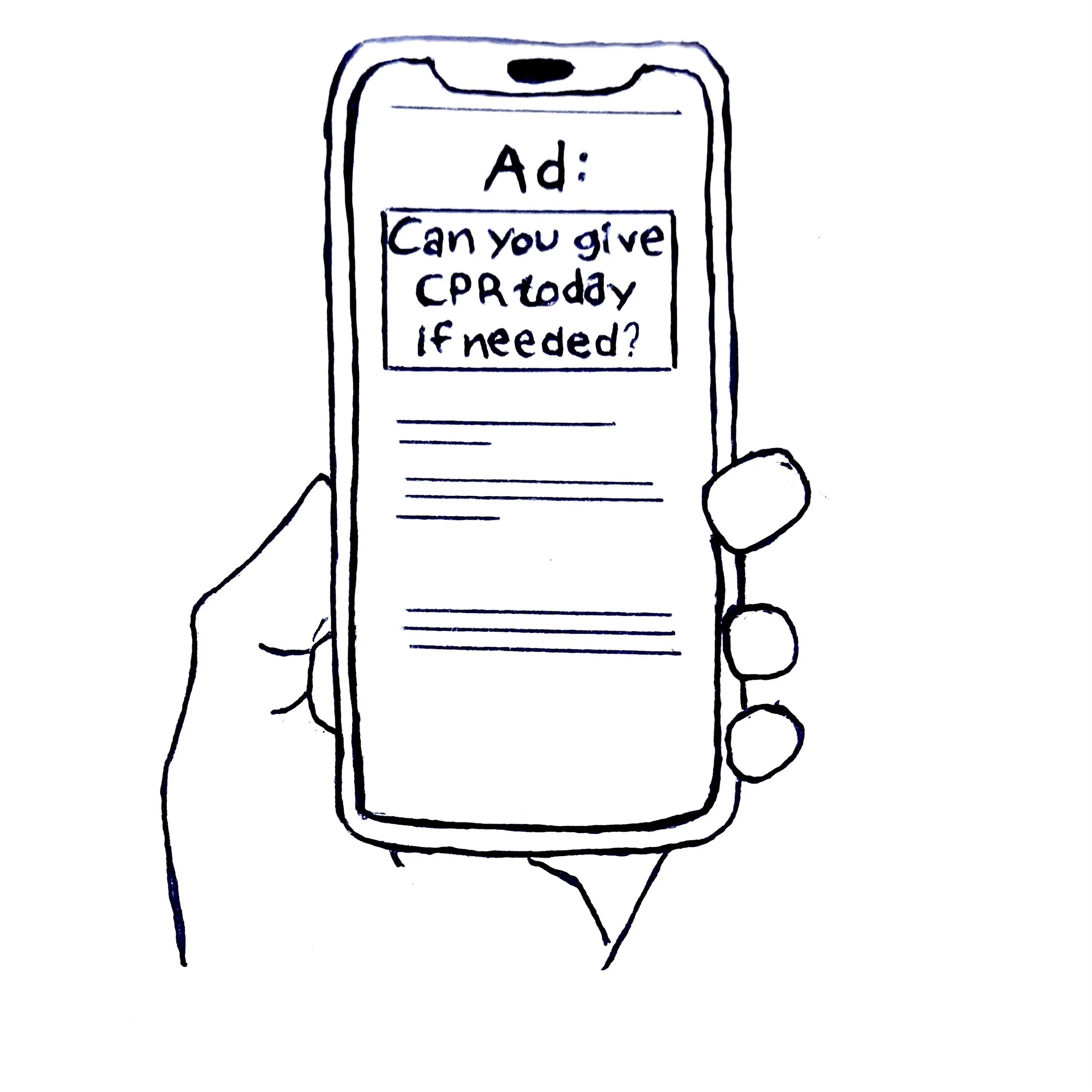
2 Notices ad on phone and thinks: “I had training once, but I wouldn’t know what to do if something happened.”
User flow

Sitemap

Paper wireframes
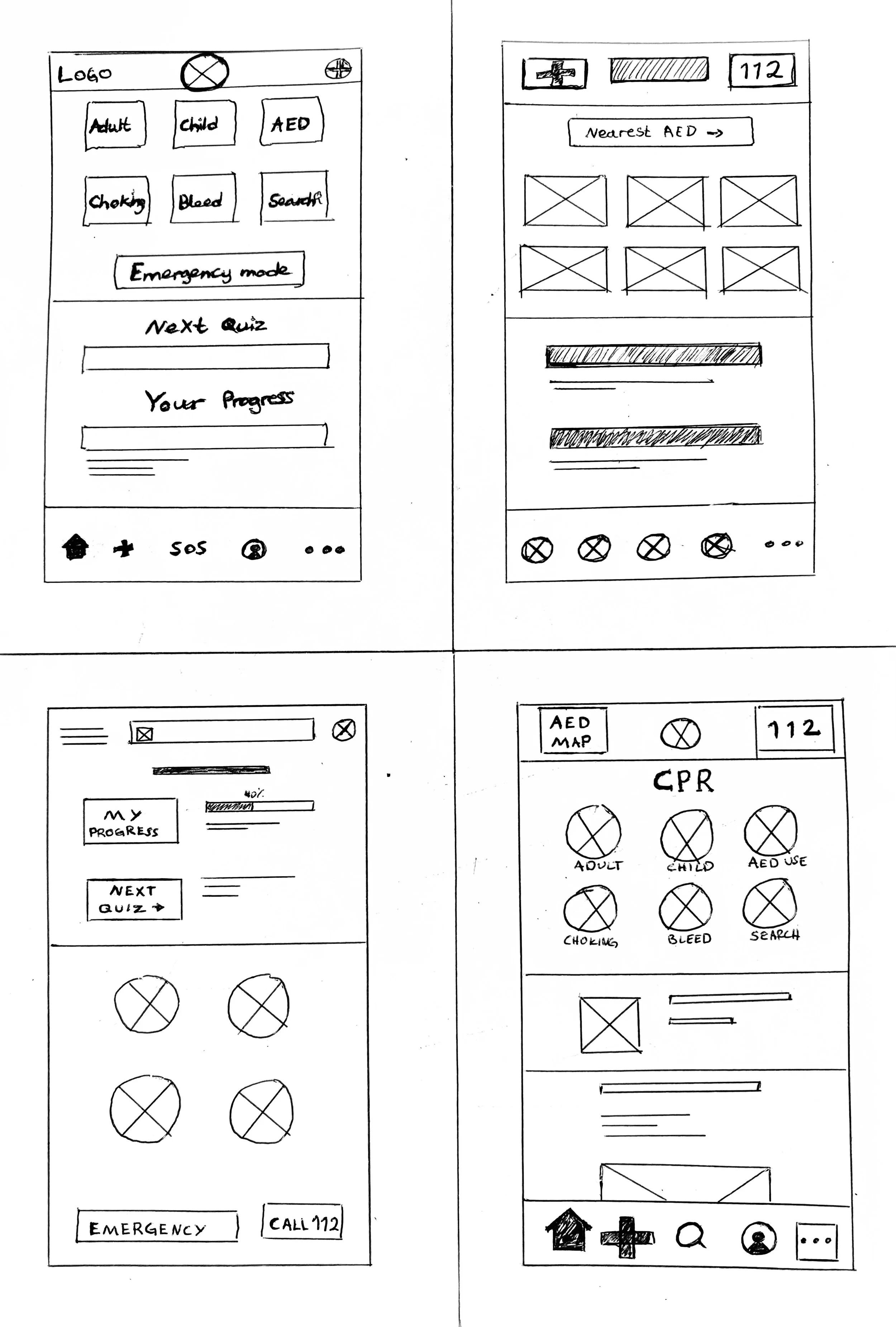
Digital wireframes


Low-fidelity prototype

1 The user sits on the couch in the living room, scrolling on their phone.
3 The user downloads the app and starts learning.
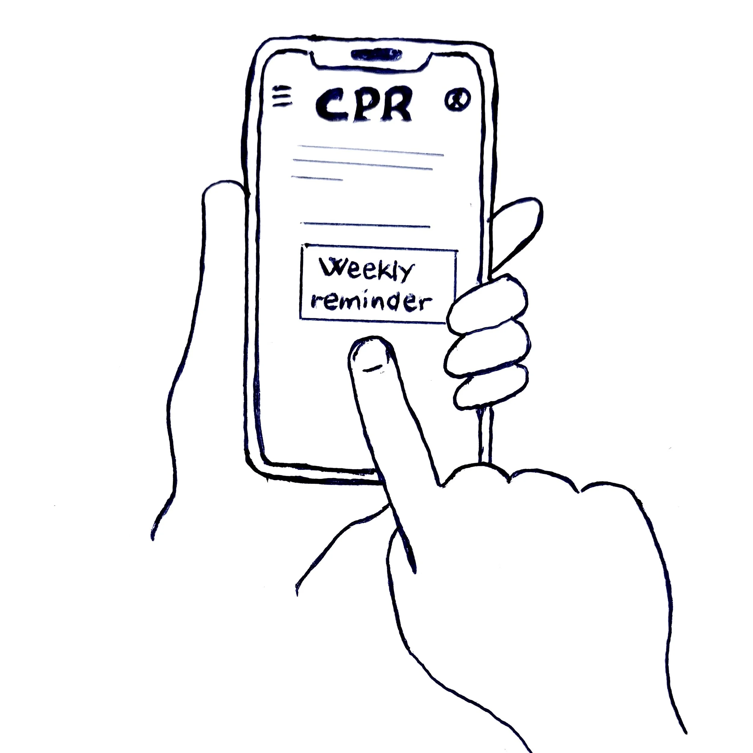
4 Sets weekly reminder notification, and chooses the time and date.
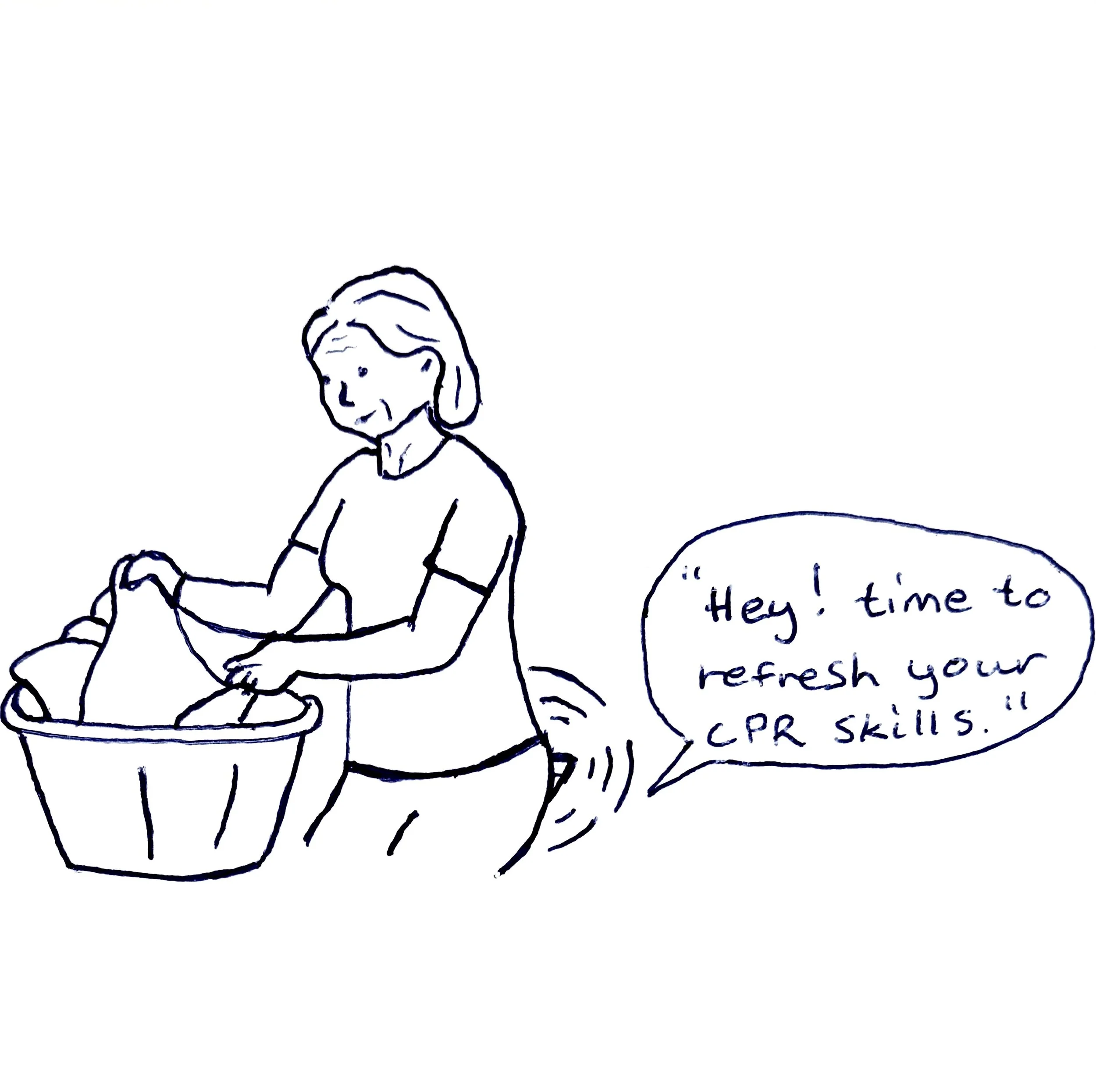
5 One week later, the user gets a notification with a reminder to refresh CPR knowledge.
6 The user takes a 60-second quiz and gets positive feedback.

Testing
Usability study
I conducted a usability study to test the main user experience of my low-fidelity prototype and identify usability issues, particularly for users with hearing loss, reduced vision, or limited digital literacy.
I wanted to understand the specific challenges users face in the process of finding content, completing a weekly quiz, and setting a weekly reminder. I also had the users provide general feedback on their experience.
Synthesizing data
I identified patterns and themes in my data, and translated my themes into insights I can apply to my designs.
Refine
Insight 1
The buttons for modules and quizzes need to have bigger contrast while hovering/pressing.


Action: I changed the contrast of the text and the background in the cards while hovered by making the background color lighter. I checked the contrast to be within accessibility standards using Web content accessibility guidelines (WCAG).
Insight 2
The homepage and the learning page should be combined so that there are fewer pages in the menu for simpler navigation


Action: I combined the learn- and home page, making “learn” the first page the user sees. I did this with the main purpose of the app in mind: to enable users to quickly and easily learn CPR without needing to search for information.
Insight 3
There needs to be a shortcut to set a weekly reminder that the user can easily find.

Action: To support ease of use, I included a visible prompt and an accessible button, allowing users to quickly navigate to settings and set a reminder.
Insight 4
The header buttons need to be less distracting while still being emphasized.

Action: I made the buttons smaller and placed them together on the other side of the logo. This way, the buttons blend in more with the rest of the content, still being easy to spot by the user wherever they find themselves in the app.
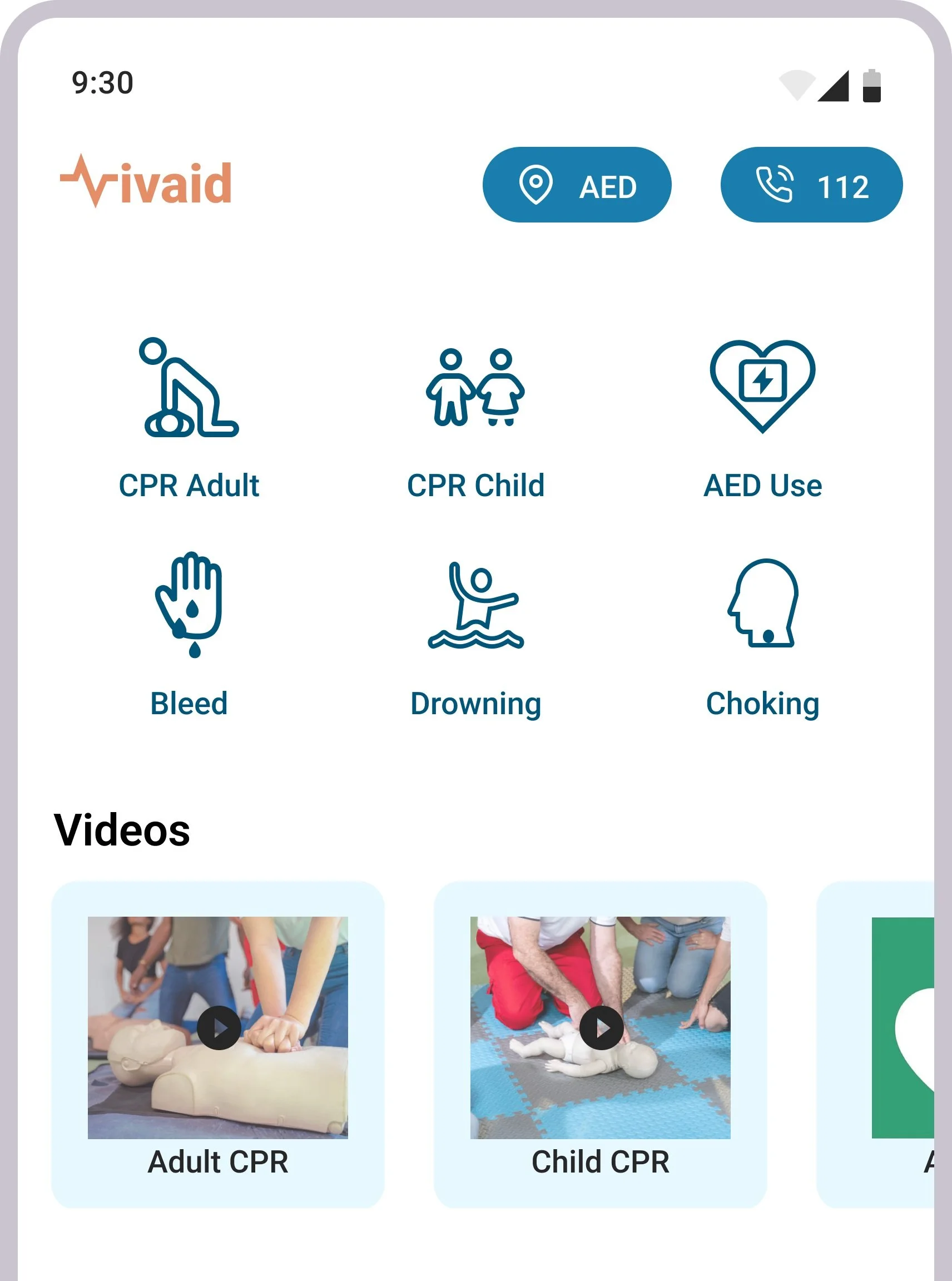
Prototype

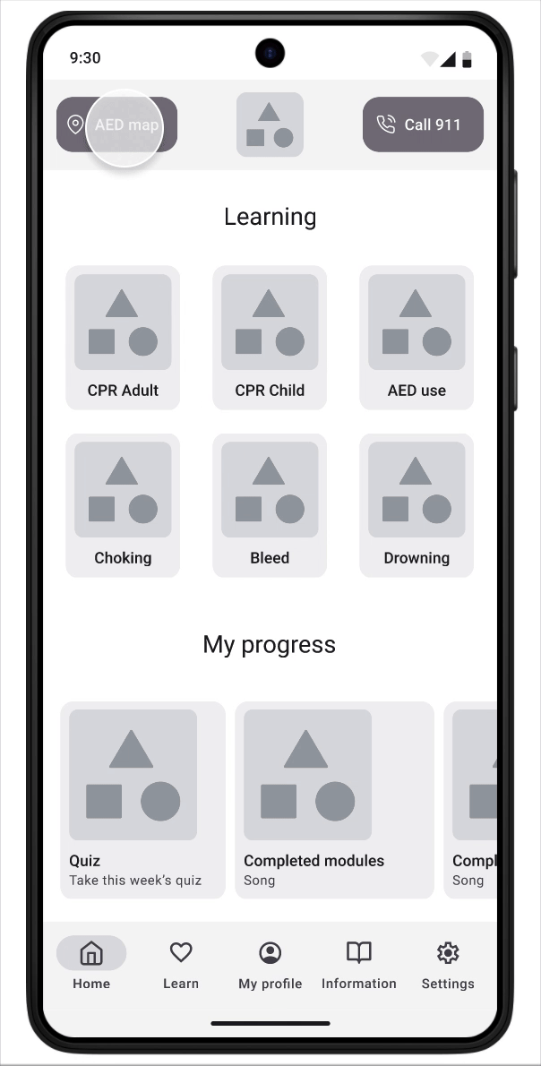
Find the nearest defibrillator in the AED map, and a direct call button to the emergency number.
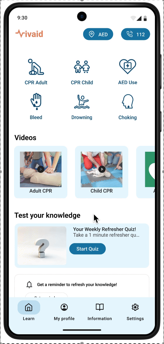
Additional information about lifesaving, recent CPR updates and guidelines, and how to get certified with practical CPR training courses.

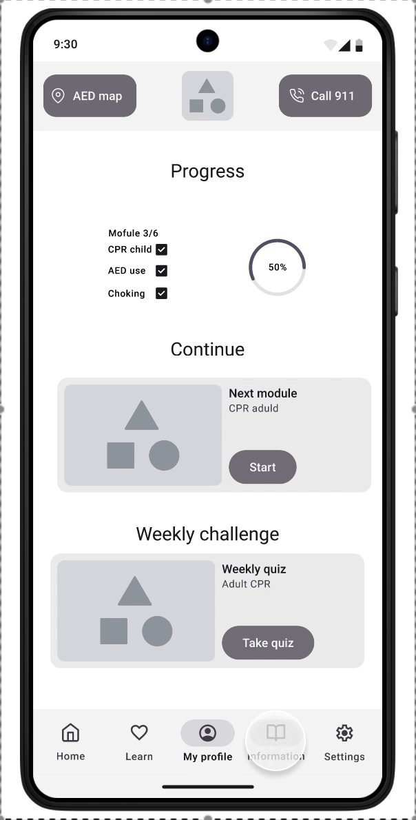
Learn CPR with modules and quizzes. Keep track of your learning progress.
Adjust accessibility settings and set notifications for the knowledge refresher quiz.
Looking back
This project challenged me to think beyond basic functionality and truly consider what makes a learning tool accessible, reassuring, and empowering—especially in high-stakes, time-sensitive situations.
Using the design thinking process, I kept returning to the real lives and needs of users like my personas, Daija and Mateo.
For Daija, that meant clear, voice-supported instructions, easy-to-read text, intuitive directions and thoughtful color contrast to accommodate her technological level and reduced vision.
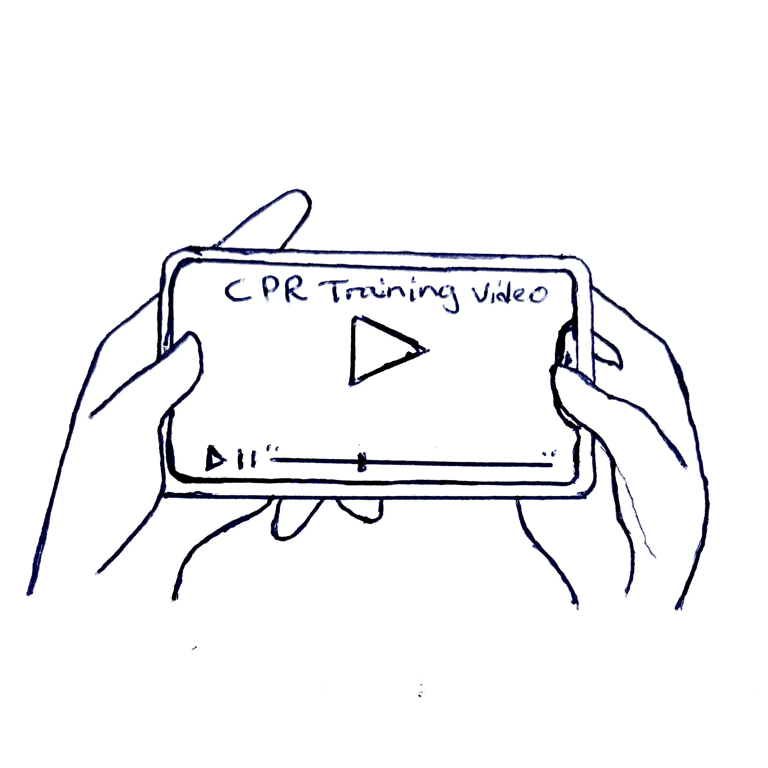
For Mateo, it meant designing a fully visual learning experience, complete with captions, videos, and strong visual cues, so that he could confidently learn emergency CPR without relying on sound.
While this project was completed in just two weeks, it deepened my understanding of how inclusive design can have life-saving impact. Through rounds of user research, usability testing, and continuous refinement, I created a high-fidelity prototype that not only teaches CPR but also supports users with diverse physical and sensory abilities.
What’s next?
Given more time, I would continue to expand this project in a few key directions to make the app even more inclusive, practical, and life-ready:
Real-time practice mode
More inclusive language support - including ASL/IS interpretation
Offline functionality
Integration with local emergency services
If you have thoughts, questions, or feedback on this case study, I’d love to hear from you!