The Morbury museum

A responsive website
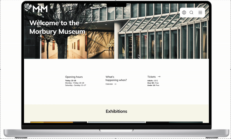
Exterior view of the Morbury Museum with modern architecture, glass windows, and entrance. The museum's website features sections for exhibitions, tours, events, and visitor information.
Screenshot of an online art gallery exhibitions page showing past, current, and upcoming art exhibitions with images of artworks and visitors in galleries.
Online ticket booking page for a museum, showing ticket types, quantities, and a calendar for selecting the date.

The product

This is a responsive website for a public art museum to advertise exhibitions and events, provide museum information, and enable patrons to schedule visits.

Project duration

3 weeks - March 2025

My role

This is an individual project that allowed me to plan and direct each step of the design thinking process as a UX designer.

Responsibilities

User research, conducting interviews and competitive audits, paper and digital wireframing, low- and high-fidelity prototyping, testing, usability studies,  iterations, and design.

The problem

It is hard to find the Morbury Museum’s upcoming exhibitions and events without having to go to the museum in person. You also have to book tickets over the phone or in person.

The goal

Let users have an easy way to find exhibitions and events and book tickets online.

User research

I interviewed family and friends who I know visit museums and galleries, to get to know their needs and frustrations. I gathered information about their experience with similar products and made a persona based on the common pain points. I also did a competitive audit on 4 other websites with a similar purpose and user group.

I discovered that museum websites have a wide range of users in different age groups who have very different needs. I therefore wanted to make a design that was easy to use with clear and simple paths to the goal.

Pain points

A large green circle with a black number 1 in the center, typical of a race or competition marker.

“I can’t find a way to book tickets without having to call the museum or go there in person.”

Navigation

A pale green circle with the number 2 in bold black font in the center.

“I miss out on exhibitions because it’s hard to find information about when they are happening.”

Experience

Green circle with the number 3 in black text.

“I find it hard to plan my museum visits, because I don’t know if I can get between exhibitions without climbing stairs.”

Accessibility

Ben

Line drawing of an elderly man in profile wearing glasses and a jacket.

Age: 74
Education: Teacher
Hometown: Oslo
Family: Lives alone
Occupation: Retired

 “I don’t like to disturb the front desk by calling every time I want information or to book tickets, but I also really enjoy the nice interactions with the wonderful staff.”

Ben is a 74-year-old retired teacher who lives in Oslo alone. He likes to go to museums and needs an easy way to find exhibitions and book his visits. He doesn’t like technology and appreciates the interaction with real people when booking visits. He also has low vision and finds it difficult to climb stairs.

Even though Ben is a fictional character made by me, his needs are real and based on common pain points defined in the user research. Ben represents the user group and will help me keep the user needs in mind throughout the design process.

Goals 

  • I want to easily find exhibitions and events at my local museum without having to go to the museum or call.

  • I want to book tickets without waiting in line on the phone.

Frustrations 

  • I’m not able to get an overview of the museum’s exhibitions and events without calling and asking the front desk or going to the museum in person.

  • I often wait in line on the phone because of high demand, and sometimes I don’t get through at all.

  • I’m not sure if I will be able to go between exhibitions without climbing too many stairs.

Problem statement:

Ben is a retired  74-year-old who often visits the local museum and needs a way to get an overview of exhibitions and book visits online because he finds it difficult to find exhibitions without having to go to the museum, and often waits in line while booking tickets over the phone.

User journey map

A comprehensive table comparing actions and steps for finding solutions, visiting exhibitions, purchasing tickets, and booking tickets online. The table includes specific instructions and emotional responses related to each task.

I used the persona, Ben, to create a fictional user journey map that describes his journey from having a problem to reaching his goal of finding and booking a visit to the Morbury Museum.

I tried to imagine Ben’s needs and potential problems that might occur through the process of finding and booking a ticket using my low-fidelity prototype, based on his character.

Competitive audit

I explored different museum websites with similar offerings that focus on the same audience. I researched the different strengths and weaknesses in the products and analyzed my findings in a competitive audit. This helped me solve usability problems and gave me many tools to ideate further on my design.

See competitive audit

Starting the design

Sitemap

Website homepage layout with menu options arranged in three columns, featuring categories such as 'What's on?', 'Visit', and 'About us', each with subcategories like 'Exhibitions', 'Tickets', 'History', 'Research', 'Events', 'Information', 'Accessibility', and 'Contact us' on a black background.

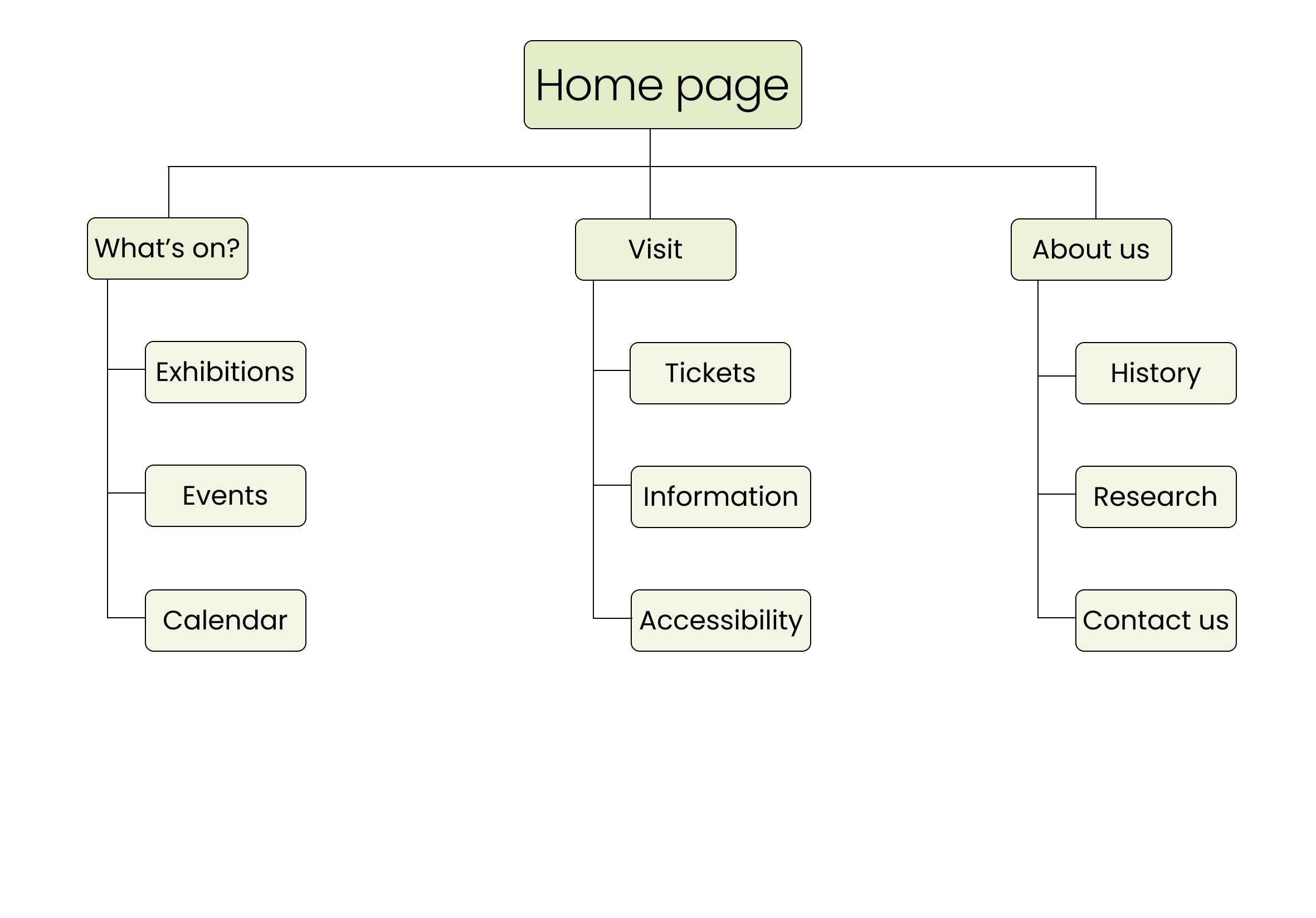
The user group of a museum website has a wide range of user needs and technological abilities. I wanted to make the website easy to use without any unnecessary add-ons to the navigation. It’s important to make it clear, and almost impossible not to find what you are looking for.
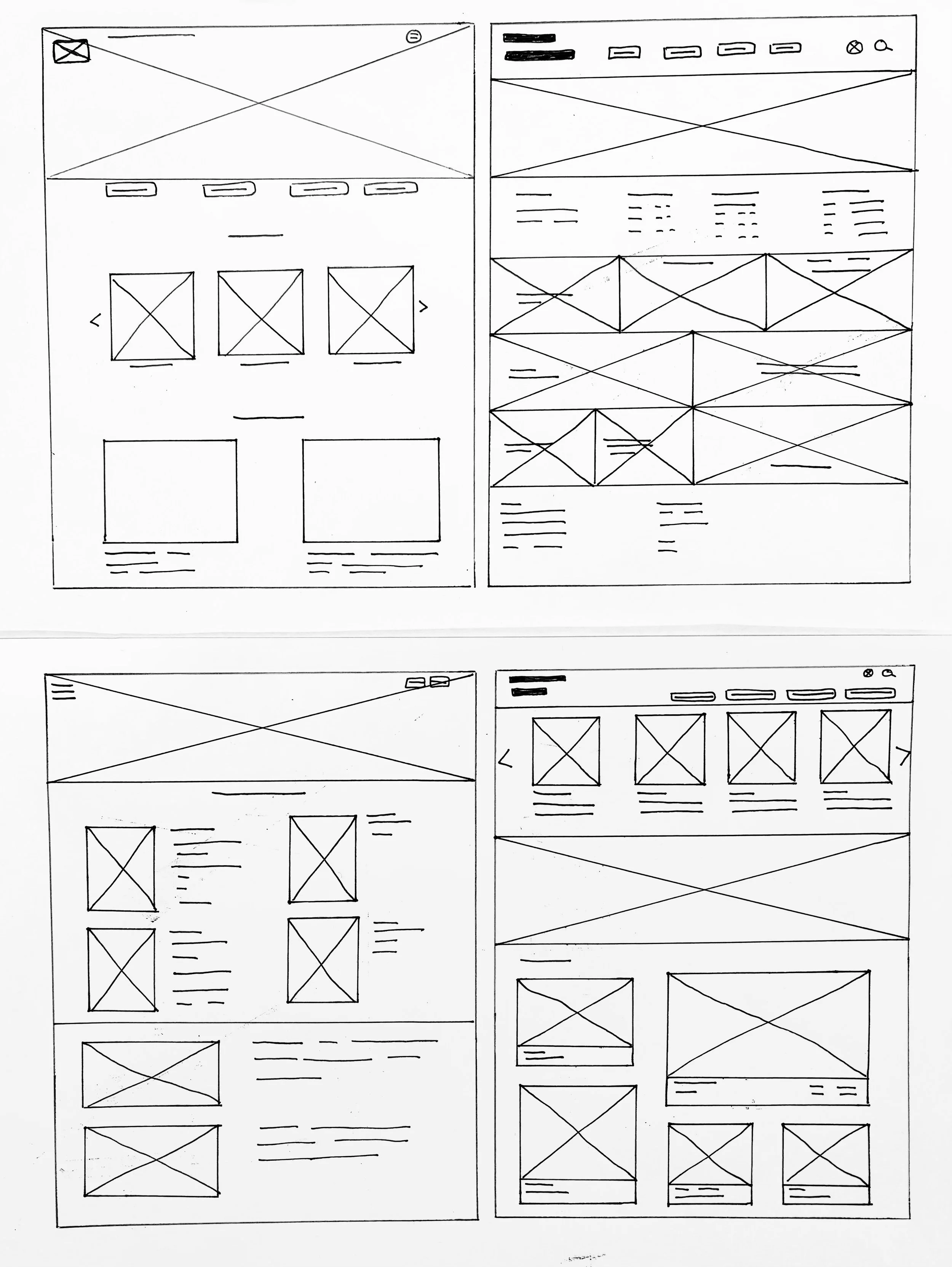
Paper wireframes 

I sketched out paper wireframes for my homepage, both for the desktop screen and the mobile screen. I used what I liked the most from each wireframe to create a refined digital wireframe.
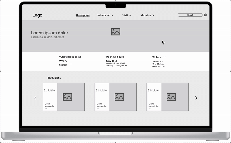
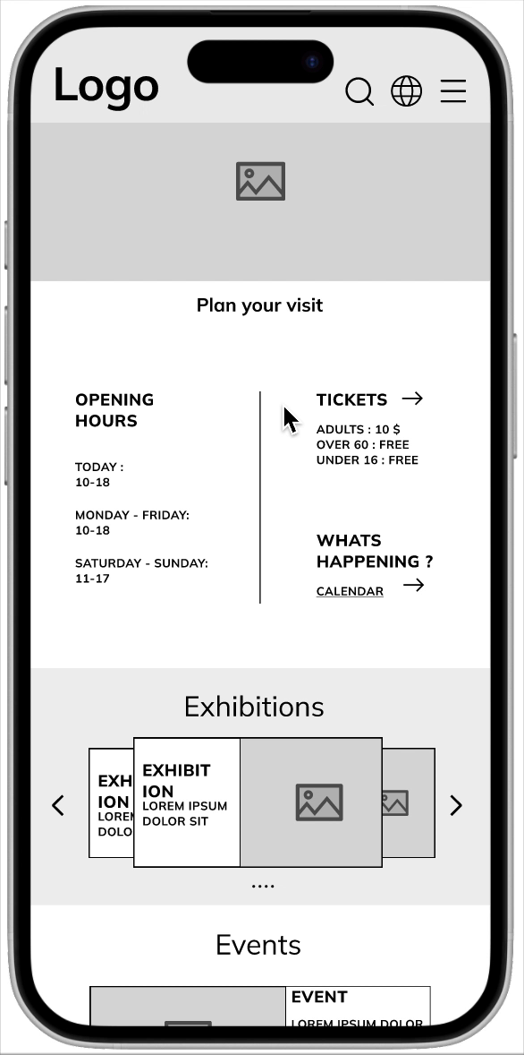
Four wireframe sketches of different webpage layouts with various sections for images and text.
Hand-drawn wireframe layout of a webpage with a logo at the top, placeholder for a slogan, navigation icons for menu and search, two side-by-side content blocks with images and arrows indicating they are different, and a larger image or section at the bottom with lines suggesting text.

Digital wireframes

Website homepage layout with navigation menu, search bar, placeholders for images, and sections for exhibitions and events.

Easily find important navigation, such as “calendar overview”  and “tickets”, on the homepage.

Black background with colorful paint splashes and the white words "Virtual Ink" in the center.
Diagram showing the roles and interactions between a user, chatbot, and fetcher in a digital system.

Scroll through exhibitions and events.

Screen size variation

Museum ticket booking webpage displaying ticket options, calendar for October 2020, and a special exhibition ticket for a tour priced at $15 for adults and $10 for students.
Museum ticket booking page showing October 2020 calendar, ticket options for adults, students, seniors, children, and companions, with a total price of USD 10, and a
Web page screenshot of an exhibitions section with current and upcoming exhibitions, placeholder images, and navigation arrows.
Mobile app screen showing exhibit listings with placeholder images and text, divided into sections labeled Current, Coming, and Previous.

Low-fidelity prototype

A website displayed on a laptop screen with a header containing the logo, navigation menu, search box, and a globe icon. Below the header, there's a grey section with a placeholder image, some text, opening hours, ticket information, and a section titled 'Exhibitions' showing three exhibition listings with images and descriptions.
A mobile phone screen displaying an event or exhibition website. The top has a placeholder for a logo and icons for search, globe, and menu. Below is a section titled 'Plan your visit' with opening hours and ticket information including prices. There is also a section titled 'Whats happening?' with a link to a calendar, and a carousel of exhibition banners with placeholder images and text, followed by a section for events.

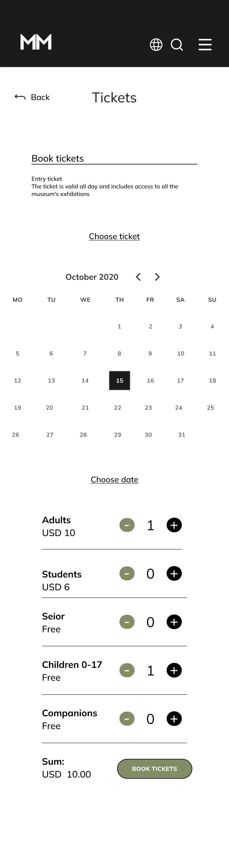
I used a sequential, step-by-step model to create the user flow for booking tickets to an exhibition or an event.

Usability study

I conducted an unmoderated usability study, where I tested my Low-fidelity prototype on family and friends who visit museums and galleries.

Parameters

Black clipboard icon with lined paper on a light green circular background.
Map pin icon on a light green circular background, representing location or navigation.
Icon of two black stylized human figures on a light green circular background.
A clock icon with a round face, showing the time as 4:00, on a light green circular background.

Participants:

4 participants

Length:

20-30 minutes

Location:

Oslo, remote

Study type:

Usability study

Findings

A large circular sign with a light green background and a black number one in the center.

Homepage
It is hard to separate some of the information on the mobile homepage.

A large number 2 in black on a light green circular background.

Exhibition overview
The user can’t get a good overview of the different exhibitions on the exhibition page.

A light green circle with the number 3 in black in the center.

Event tickets
The user should be able to navigate to “book tickets” by selecting an event or exhibition.

Refining the design

Finding 1

“It is hard to separate some of the information on the mobile homepage.”

My goal here is to make it easier for the user to locate the information they need. To do this, I implemented more whitespace and used a border to separate the information.

Website homepage for The Morbury Museum with information on hours, tickets, exhibitions, and tours, featuring images of a modern building and visitors observing artwork.

Before usability study

A website layout with a logo, navigation icons, and sections for planning visits, exhibitions, and events. The page includes details about opening hours, ticket prices, and upcoming exhibitions and events in a clean, monochrome design.

After usability study

A black and white line drawing of a woman with curly hair, earrings, and a dress, holding a microphone and likely singing on stage.

Finding 2

“The user can’t get a good overview of the different exhibitions on the desktop exhibition page.”

I changed the layout of the exhibition page by removing the carousel and putting all the exhibitions on display. That way, the users who don’t use the carousel don’t miss out on exhibitions.

Online art museum exhibitions page showing current, upcoming, and previous exhibitions with images of artwork and visitors in galleries.

Before usability study

Webpage layout for an exhibition site with sections for current and upcoming exhibitions, each containing placeholder image and text

After usability study

A black and white illustration of a fish with the word 'Churn' written above it.

Finding 3

“The user should be able to navigate to ‘book tickets’ by selecting an event or exhibition.”

I added a button for booking tickets to each event that directly navigates to the ticket page of the chosen event.

Website page listing various upcoming events and tours, including open day, performance, workshop, kids' day, guided tour, and private tours, with event images and descriptions.

Before usability study

Webpage view of an events page with sections for Tours, Group tours, Family events, and Workshop, each containing placeholder images, event titles, and descriptions.

After usability study

A black and white illustration of a person rising from a bed, stretching, with a clock on the wall indicating early morning.

Mockups

Original screen size

Gallery page displaying current, upcoming, and previous art exhibitions with images of artworks and visitors in the museum.
Museum website homepage with header image of a modern building, welcome message, opening hours, exhibition and tour information, and placeholder text.
A webpage for booking museum tickets showing options for adults, students, seniors, children, and companions, with a calendar for selecting the date in October 2020.

Screen size variations
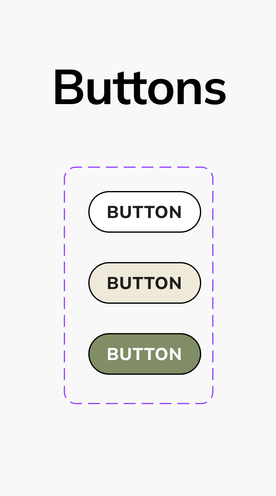
A mobile website of an arts organization displaying upcoming tours and events, including open day, performance, workshop, and kids day, with event images, descriptions, and ticket buttons.
The website for The Morbury Museum featuring its name, opening hours, ticket prices, upcoming events, and exhibition information. The background shows a modern building with glass and metal architecture.
Gallery exhibition announcement with images of paintings, visitors, and scheduling details for upcoming exhibitions at an art museum.
Digital calendar for October 2020 displaying dates, month, and year at the top. Below is a schedule for October 15, 2020, featuring exhibitions and events with images, times, descriptions, and ticket buttons.
Screenshot of a mobile app page for booking tickets to a museum exhibit, showing the calendar for October 2020, options to select the number of adults, children, and other categories, and a "Book Tickets" button.

Design system

Typography style guide showing various font sizes, weights, and styles for headers, subtitles, body text, bold, small, extra small, button, and overlay text.
Color palette with beige, light green, and black swatches labeled Lush, Lush light, Leaf, and Night, alongside grays and black and white, with labels indicating primary, secondary, accent colors, and their respective color codes.
Website wireframe mockup showing header, black banner with white logo 'MM', navigation options for back and exhibitions, and icons for globe, search, and menu, with some mobile interface design elements
A digital calendar interface for October 2020, showing selected event details on the 15th, including two exhibitions from 10 a.m. to 5 p.m., with options to adjust the number of adults attending and input personal information.
A guide showing different icons including arrows, a globe, lines, social media icons, and a back button.
A graphic design showcasing a large heading labeled 'Buttons' at the top, followed by three rounded rectangular buttons stacked vertically, each labeled 'BUTTON' in bold text. The buttons have different background colors: white, beige, and green, outlined in black, all enclosed within a purple dashed outline.
Placeholder image with the words 'Logo' at the top and large letter 'M' in the center.

High-fidelity prototype

Screenshot of the Morbury Museum's webpage featuring a modern building with glass and steel architecture, welcoming visitors and providing information about opening hours, exhibits, tickets, and exhibitions.
The image shows a mobile screen displaying the Morbury Museum's website, featuring information about visit planning, opening hours, ticket prices, current exhibitions, and upcoming events.

Considerations

On of Ben’s frustrations is navigating between exhibitions without having to climb too many stairs. He needs a way to preview the accessibility of the museum before his visit.

Screenshot of an accessibility information webpage with sections on accessible exhibitions, parking, toilets, service dogs, and a sensory map of a museum.
A black and white picture of a bookshelf filled with various books.

I wanted Ben to have a clear overview of what to expect when attending an event or exhibition. I created a dedicated accessibility page that provides information about access between exhibitions, parking, restrooms, service dogs, and sensory maps. This makes it easier for Ben and other visitors with accessibility needs to plan and enjoy their visit without worrying about unexpected challenges.

Museum website homepage with navigation menu including sections for What's on, Visit, About us, Exhibitions, Tickets, History, Events, Information, Research, Calendar, Contact, and Accessibility. Background features trees and modern glass architecture.
A minimalistic black and white landscape with a mountain, body of water, and a small boat.

To ensure that the accessibility page is easy to locate and use, I incorporated a dedicated button in the main navigation menu.

Confirmation page for a museum booking showing date, ticket prices, and a back button.
A black and white image of a person sitting in front of a computer, with a mountain landscape visible on the screen.

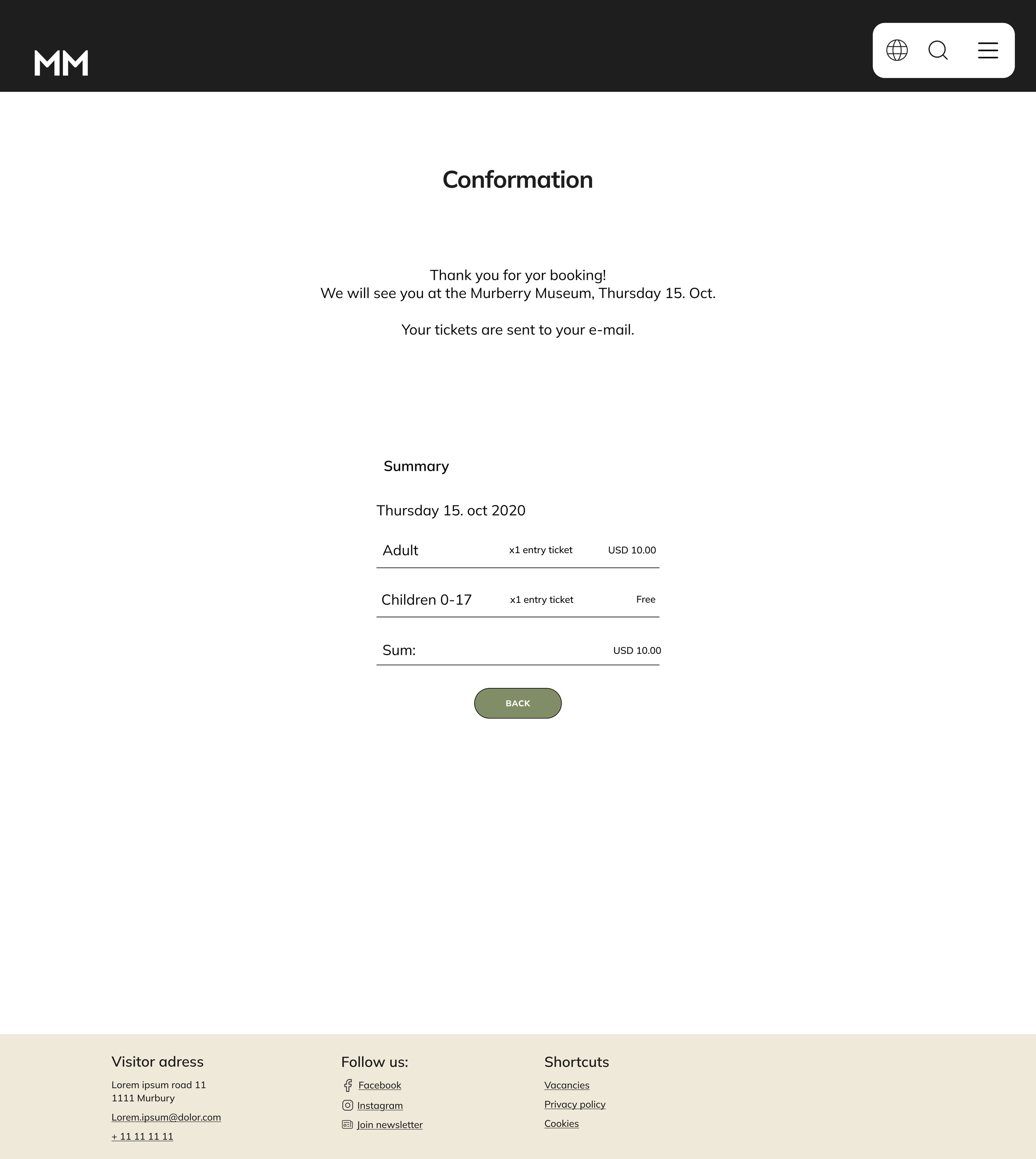
Ben also admits that he doesn’t like technology and appreciates the interaction with real people when booking visits. I designed a clear confirmation page with a friendly, personalized message to create a more welcoming and human-centered experience.

Accessibility considerations

Green circular sign with the black number 1 in the center.

High contrast 

I used high contrast between text and background to make it easier for users to read.

A green circular background with a large black number 2 in the center, resembling a numbered sign or countdown marker.

Whitespace and borders 

I used white space to reduce cognitive overload and to make the content easier to process. I also used borders to create a clear separation between content.

Number three in black text on a green circular background.

Hierarchy

I have specific heading tags (H1, H2, and H3) that allow screen readers to interpret the hierarchy of a page for users.

Takeaways

What I learned:

The most important takeaway for me from this design project is the importance of keeping the user at the center of every design decision. It is easy to make changes based on what “I” think is the best solution, but after my usability studies, I quickly learned that the user’s needs can be very different.

Impact: 

The target users shared that the website is intuitive and easy to navigate. The design is clean and simple, making room for images of exhibitions and events.

Next steps

Obtain UX/UI feedback from designers with more experience in the field to improve the overall design and functionality.

When I have documented all feedback that was provided, I will make the necessary design updates in order to improve the website´s overall experience.

Help me grow!

I would love to hear your thoughts and feedback.

Reach me here