

eDays
Challenge:
Design a family schedule-management app that enables parents to manage both their schedules and their children's schedules.
Project duration:
6 weeks 30+ screens
Tools used:
Figma, Miro, Google dox, Google sheets, Google slides.
My role:
Lead UX designer, responsible for user research, design, prototyping, and testing.
The goal:
Design a product that makes it easier to manage your and your family’s activities and plans during the week.
Design process

Research
Emphasize with the user
Method
Interviews
I conducted 4 interviews with friends/family who live with other people and have busy schedules.
Secondary research - competitive audit
I used information from users’ experiences with other similar products and identified user needs and problems.
Common pain points among the users
I often double-book activities by saying yes to things before realizing new plans were made.
I find it hard to align my family’s plans with my schedule.
Difficult to keep up with the plans and activities of the rest of the family.
I don’t want to pay for a calendar app.
Personas
I used the common pain points that were defined from the interviews and secondary research to create 2 fictional personas that represent groups of similar users. This helped me keep the users in mind throughout the design process, and not design for myself or just one individual.


-
Problem statement: Reena is a 52-year-old paramedic living alone with her teenage daughter. Her daughter is in high school and Reena works variable shifts, including days, evenings and nights. She needs an easy way to coordinate her and her daughter’s schedules to ensure alignment, because she wants more quality time with her daughter.
“I sometimes feel sad when me and my daughter don’t eat dinners together throughout the week because of my unpredictable work schedule”
Reena uses reading glasses, and often finds small text on her phone difficult to read when she doesn’t have her glasses on.
-
Problem statement: Matt is a 37 year old cook that lives with his wife and two children. He works evenings, and is planning and making most meals ahead throughout the week. He needs a product that helps him stay more organized and up to date on the new activities and plans the family make, because wants to plan dinners and activities for the family without double booking.
“I don’t have control of my children's activities, when new plans are often made when I am not home. My wife wants me to check the calendar on the fridge more often, but I usually forget.“
Matt isn’t comfortable with new technology and sometimes find it intimidating and difficult to understand.
User journey map
I created 2 user journeys: a made-up series of experiences the users have as they achieve a specific goal. This was built off my 2 personas.
I used this to help identify improvement opportunities, highlight new pain points, reduce the impact of designer bias, and create an obstacle-free path for my users.
Ideation
My scheduling app will let users get a better overview of their family schedule and easily have control over plans that are made, which will affect parents and families with busy or unpredictable schedules by giving people a platform that will gather the family’s schedules in one place and make it easy to add new plans and activities. I will measure effectiveness by getting feedback from users.
Goal statement
Translate problems to opportunities.
Rapid sketching
Crazy eights: eight ideas/sketches, one minute per sketch
Brainstorming

Design
User flow
I created user flows that show the path a user could take in my design to complete a task from start to finish.
Tasks:
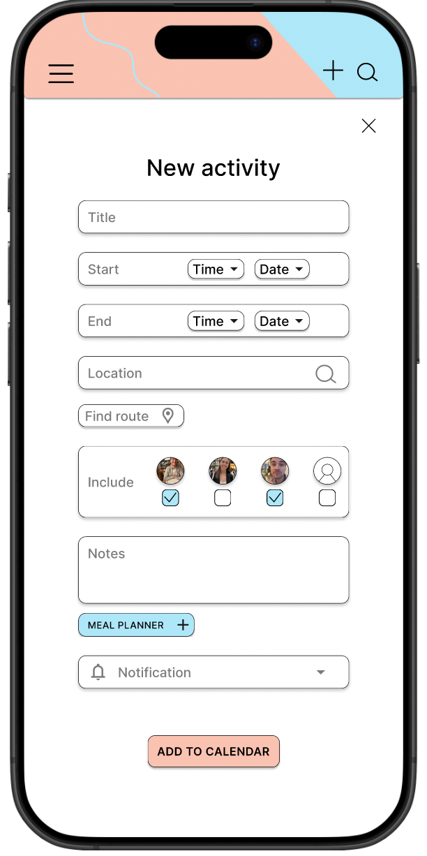
1. Add new activity to calendar

2. Invite new member to “My family”

Paper wireframes

Digital wireframes

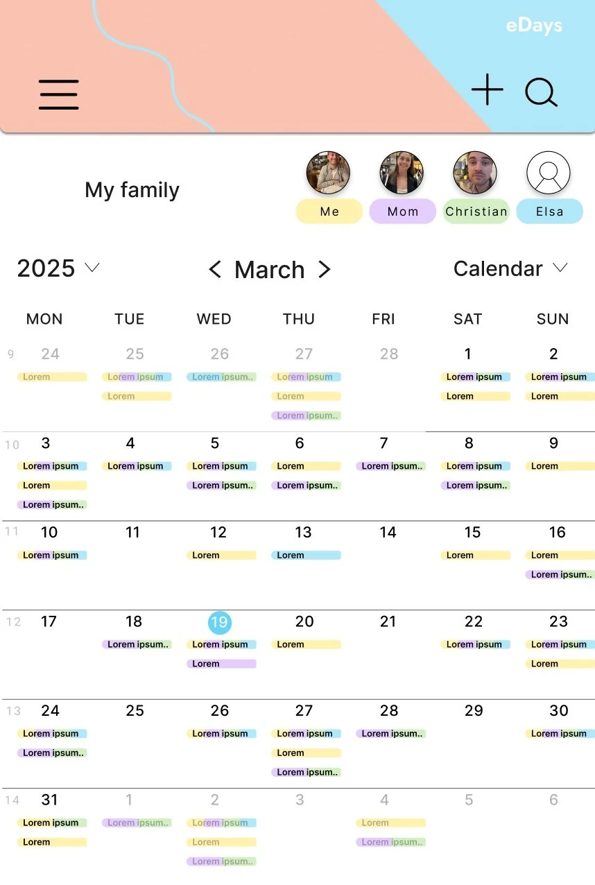
Choose which family member’s calendar you want to see
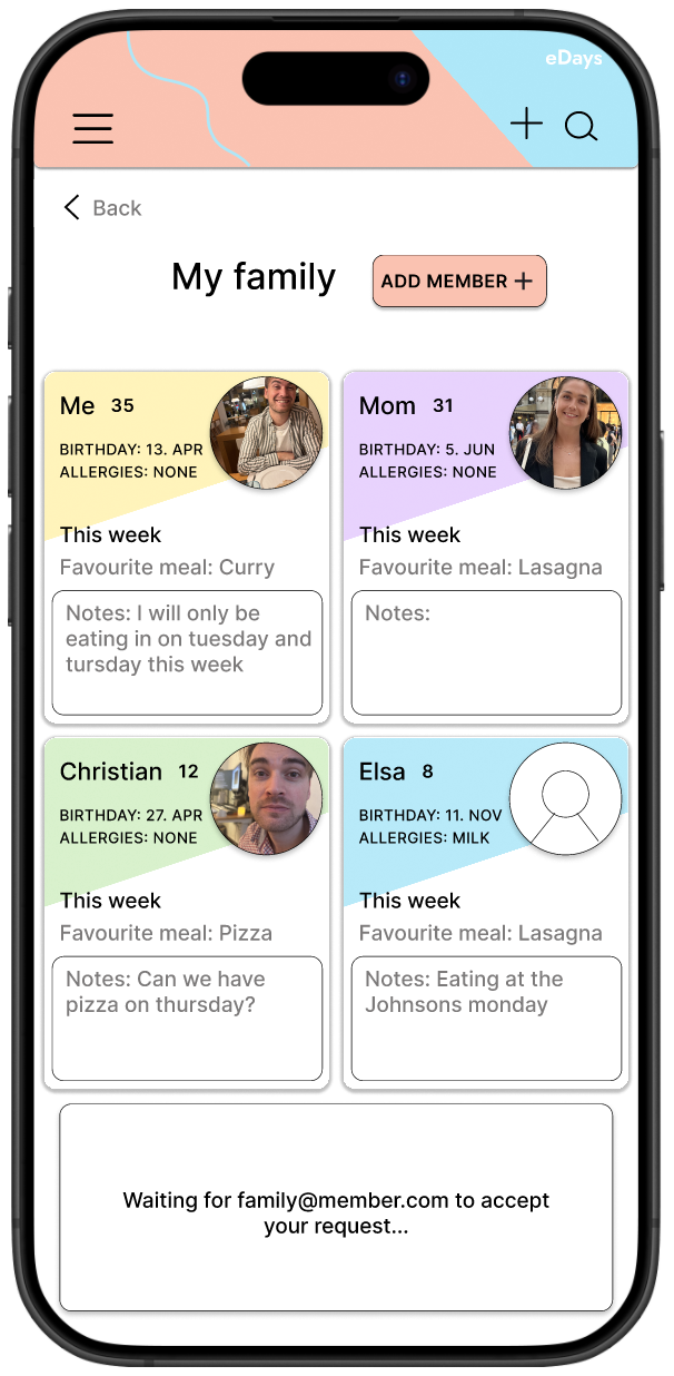
Add family members to your family calendar


Choose which family members to include in the activity, these will automatically get an invite
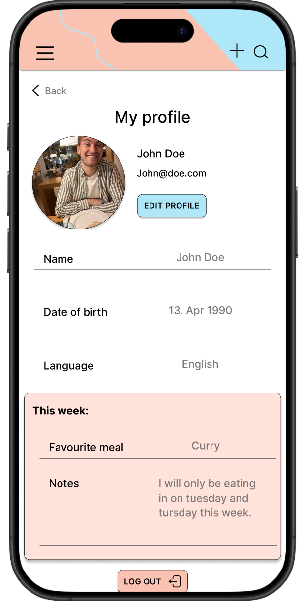
You can edit your page and write this week’s notes and favourite meal
Low-fidelity prototype

Testing
Usability study
I conducted two usability studies. First, I tested my low-fidelity prototype on three participants. The second usability study used a high-fidelity prototype and revealed what aspects of the mockups needed refining.
Findings
Usability studies Round 1 - Low-fidelity prototype
Users need a way to see that an invite to a family member has been sent and is in progress
Users should be able to add an activity in the calendar by clicking a date
Users need a way to see that they don’t need to fill in information about a member if they send an “add family member” request by email
Refining the design
Before study
After study


Usability studies Round 2 - High fidelity prototype
Users need a way to see that the activity has been added without having to locate the added activity in the calendar.
The cards with information about each family member need to be more accessible and easy to read.
There needs to be a clearer button or arrow to take the user back to the “home screen” from the “my profile” page.

Before study

After study
The second usability study revealed confusion about the text and information in the family member cards.
To make the cards with information more accessible and easy to understand, I used borders and dividers to separate the information. I also used color to separate each family member.
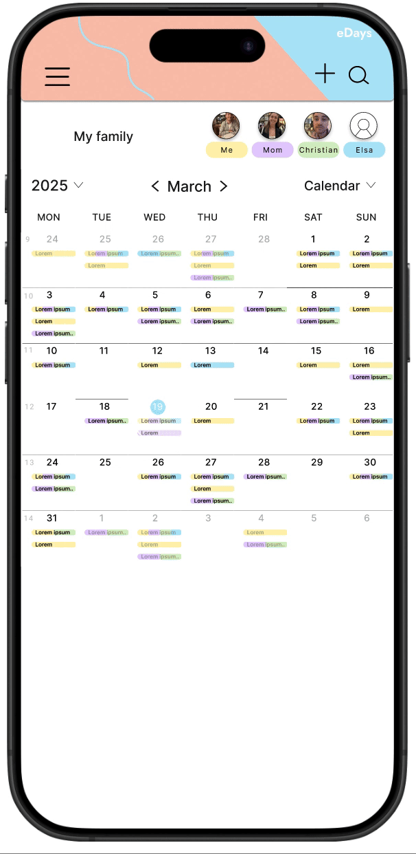
Mockups
High-fidelity prototype
Accessibility considerations
Text Size: Larger, well-scaled text makes reading easier, especially for those with poor eyesight. It's also important to allow users to adjust the text size without breaking the layout.
White Space (negative space): Crucial for reducing cognitive overload and making content easier to process. Proper white space between UI elements ensures a clean, non-cluttered design and helps focus attention where it's needed.
Borders: Creates a clear separation between content. Subtle borders can help users visually differentiate between interactive elements and other content without overwhelming the design.
Text size, white space and borders
High contrast between text and background makes it easier for users to read, especially for those with visual impairments like color blindness.
Colorblind accessibility: Using a combination of color and other visual cues (like text labels or icons) ensures that content is understandable for those with color vision deficiencies.
Contrast ratio: Ensure there’s sufficient contrast between text and background, with a minimum ratio of 4.5:1 for normal text and 3:1 for large text, as recommended by the Web Content Accessibility Guidelines (WCAG).
Color and contrast
Importance for Screen Readers: For those using screen readers, a proper hierarchical structure in the HTML, with correct use of headings, lists, and labels, ensures that screen readers can easily interpret and convey the layout to users, making the content easy to navigate.
Visual Hierarchy: Use larger fonts for headings, bolding for emphasis, and contrasting colors to establish the relative importance of content sections.