Redesigning the Team Page for Dobee
How I improved collaboration, clarity, and team identity in a complex OKR environment.
My role
Head UX Designer
Scope
Full end-to-end UX
Duration
Two weeks
Product overview
Dobee is an OKR platform designed to make goal management engaging, lightweight, and transparent across organizations.
The problem
The existing team page in Dobee did not fully support collaborative goal ownership or provide a clear, intuitive way for team members to work together towards common goals
The goal
A space where teams can easily work together, manage goals, track progress, and build a shared identity.
Process
An iterative approach from discovery to final prototype over 2 weeks.
Discovery
The project began with a series of conversations with Dobee’s product owners based on feedback and needs from the costumers.
Key discovery activities included:
Reviewing existing platform patterns
Mapping product owners expectations
Identifying constraints in the current data model
Discussing how Radical Focus could be integrated
Clarifying which actions should happen on the Team Page versus elsewhere in the platform
Competitive audits
The excisting team page:
Outcome:
A set of core use cases—centered around team-owned goals, weekly reflection, and lightweight team identity—and a shared understanding that version 1 needed clarity, not complexity.
Requirements
Prioritized features based on user needs and business constraints
Must have
To explore
Iteration & Redesign
Layout option 1
Layout option 2
Product owner feedback
Need for intuitive goal previews and ability to see that you can click on a goal on the timeline
A push to surface team summaries high and center
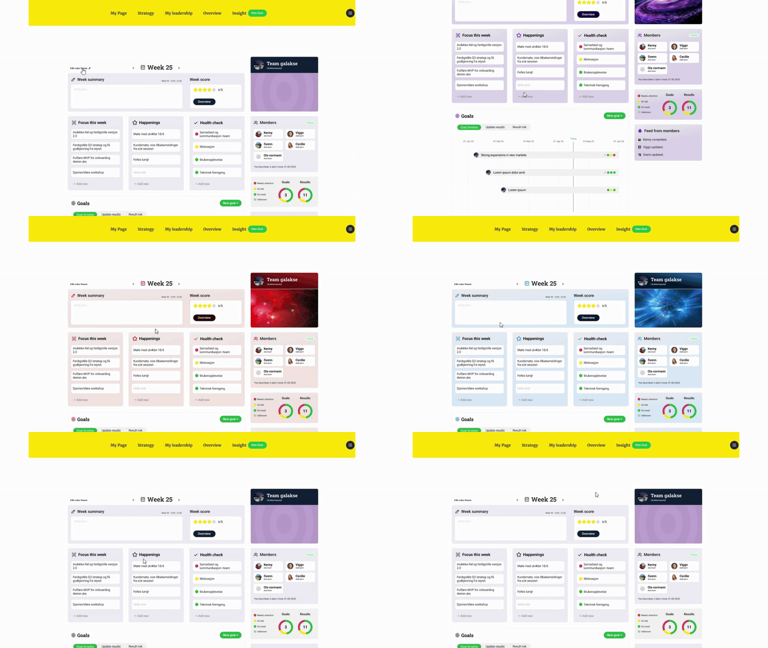
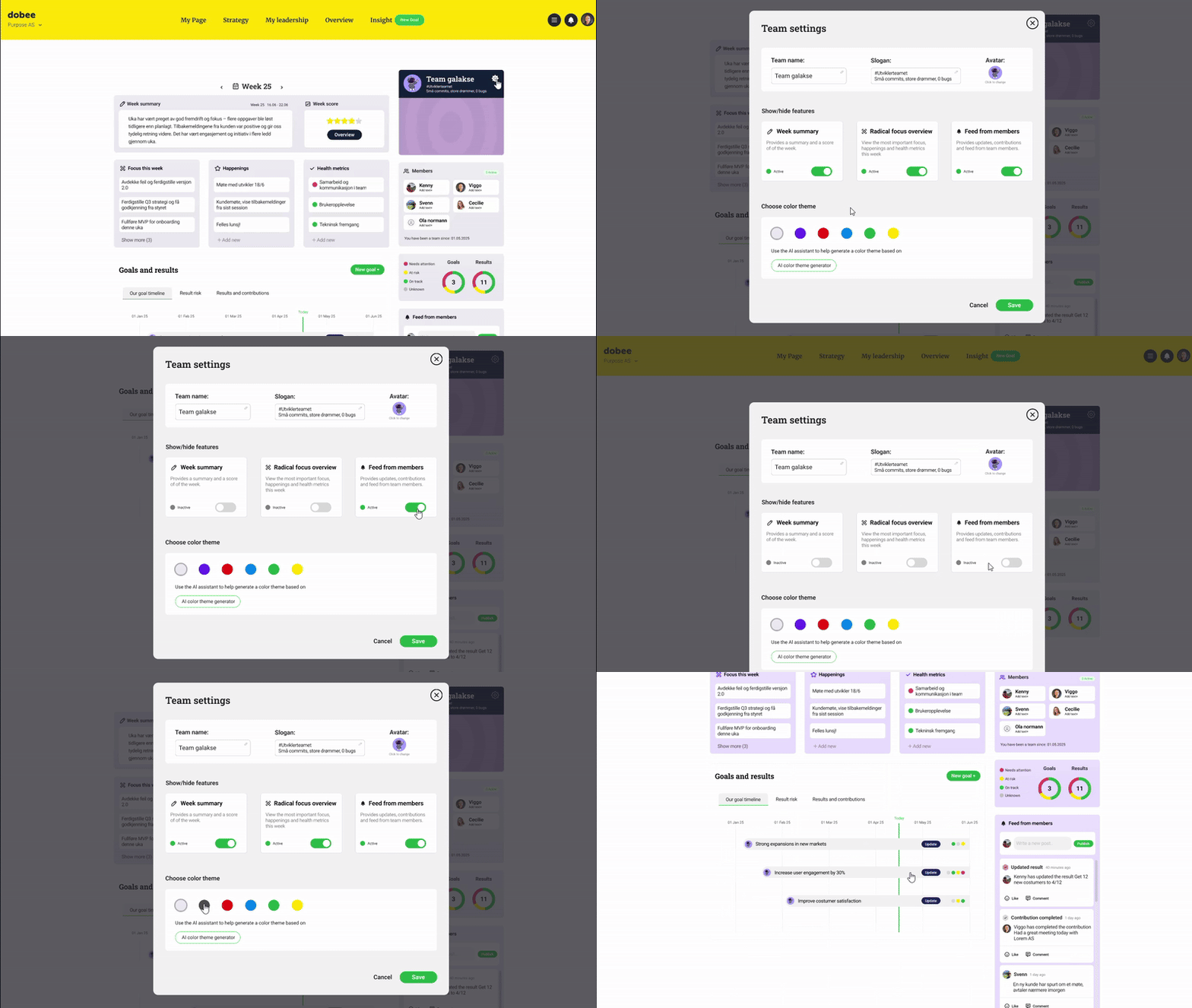
A desire for stronger team identity (theme/skin/color).
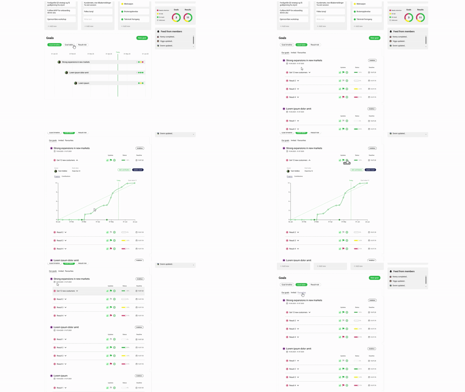
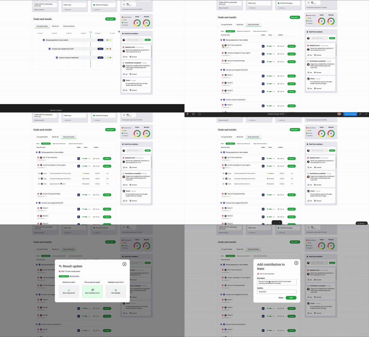
Request for a scrollable list of extended goal and result information where teammates can update and contribute
Uncertainty about goal categories and long-term ownership model
Outcome
Clear iteration tasks and reframed scope:
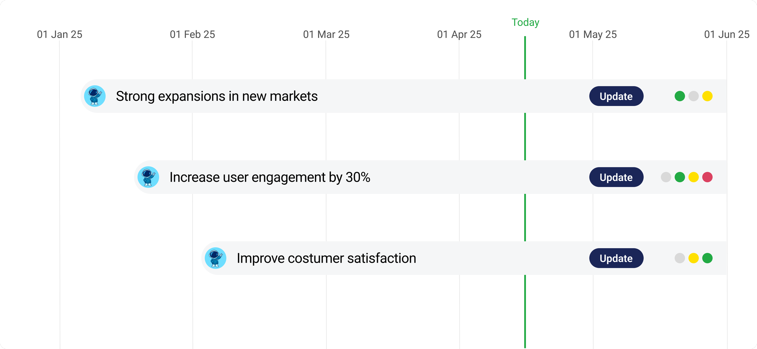
Clickable goals on a goal preview timeline - ensuring all interactions mirrored existing familiar patterns
Also making sure the team can look back on earlier summaries and scores.
Highlight week summaries and week score earlier on the page.
Introducing a stronger team identity:
Change color
Large changeable team picture
Team avatar, slogan and name
Designing a space for team members to work on results
Overview of results and progress
easily make updates, highlights and change confidence score
add contributions and see contributions from other teammates
Research - Usability study
Remote moderated testing with 3 users to validate design decisions
My Role
As Head UX Designer, I planned and conducted the study, moderated the interviews, observed task completion, documented behaviors, and synthesized insights.
Goal
Evaluate the early prototype of the new Team Page in Dobee. We wanted to understand how users navigated the page, how they completed core tasks, and where the design caused confusion or friction.
Method
Users were asked to complete core tasks in a clickable Figma prototype. For each task, I asked follow-up questions about ease of use, expectations, and feature relevance.
Tasks
1. Update the confidence score of a result
2. Contribute to a result that belongs to a goal the team is invited to
3. Change the color theme to explore team identity customization
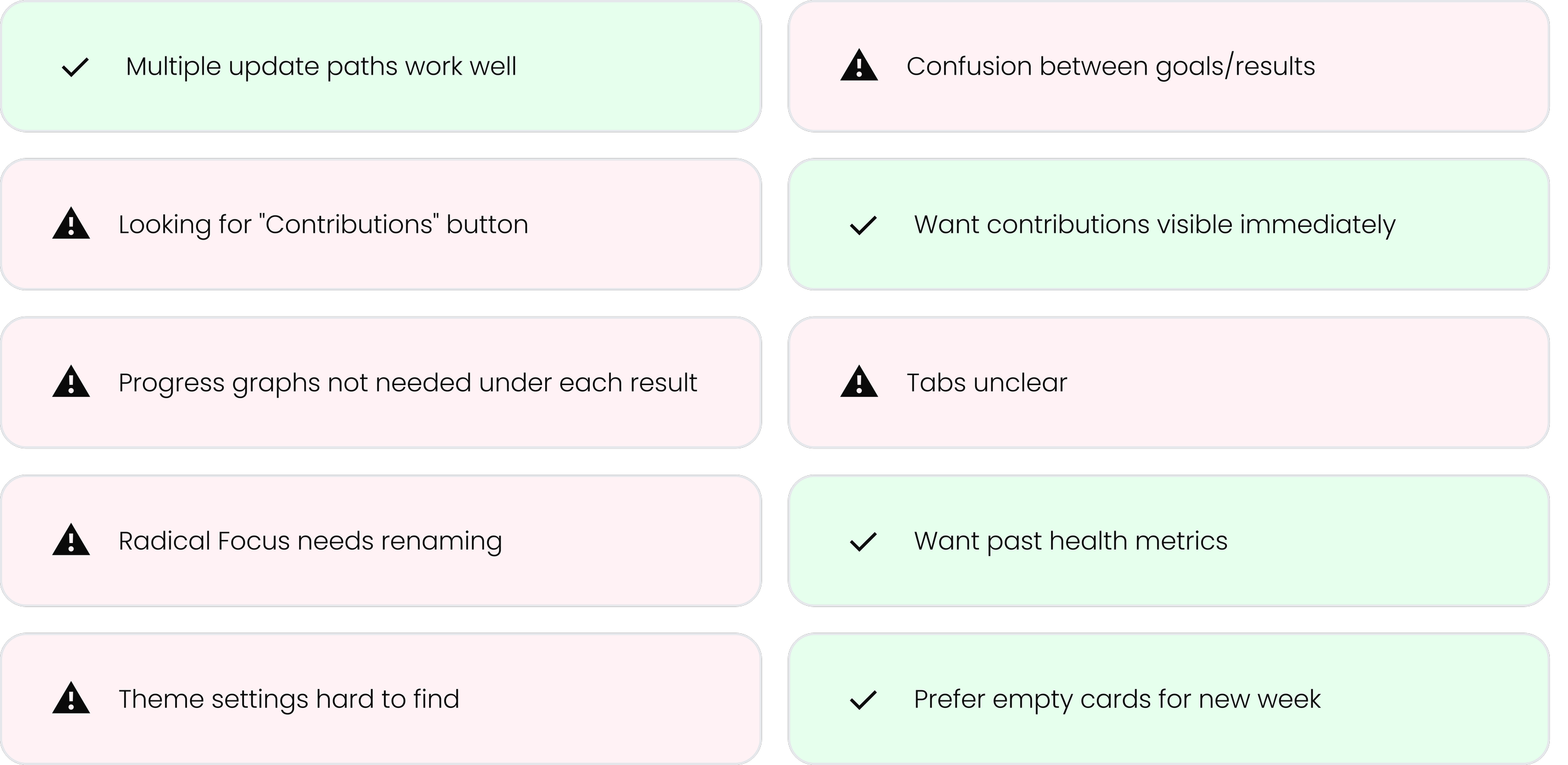
Key findings
Read more
Design desitions
The Goals and results workspace:
Use clearer hierarchy and familiar icons to differentiate goals from results.
Keep consistency in goals and results layout throughout the platform.
Simplify visual noise by removing redundant graphs, that is also shown in each goal page.
Show contributions inline when a result is opened
Improve tab design
Team identity
Make theme editing easier to locate by having an easy to find team settings where you can change team name, slogan and team avatar.
Add the option to turn on and off functionality in the team settings module
Allow renaming Radical Focus cards and other sections and terms by having “custom terms”
Overall improvements:
Provide multiple paths for updating results
Support week resets with a simple modal choice.
Make past health metrics accessible
Conclusion
This redesign made the Team Page clearer, more collaborative, and more aligned with how teams actually work. With strong foundations in place, Dobee can now scale team features confidently.
Key Learnings
What Worked
→ Iterative testing revealed insights
→ Center layout prioritized focus
→ Clear naming reduced load
→ Identity features drove adoption
Challenges
→ Balancing simplicity vs functionality
→ Managing expectations
→ Prioritizing V1 vs future
→ Maintaining consistency
Let´s connect!
Interested in discussing this project or working together?


